In SaaS, complexity is inevitable.
Permissions, workflows, dashboards, integrations, logic trees, automations—every serious product accumulates them. And yet, for the user, none of that should feel complex.
Our job as designers isn’t to remove complexity.
It’s to translate it.
Over the last few years, working with SaaS products across industries and maturity stages, we’ve learned one core truth:
Users don’t want powerful software.
They want software that feels powerful without feeling heavy.
This is how we turn dense SaaS systems into interfaces people actually enjoy using.
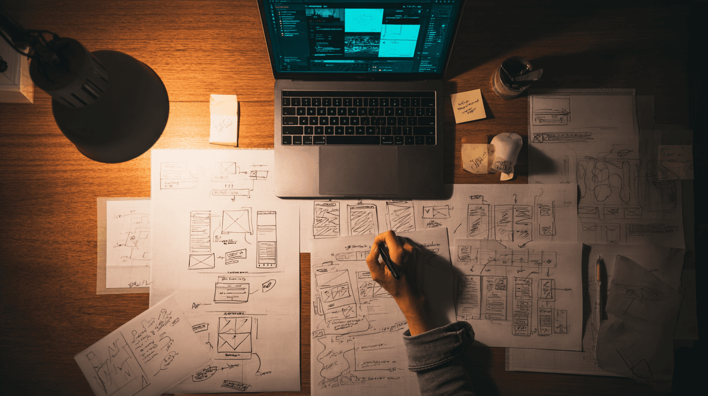
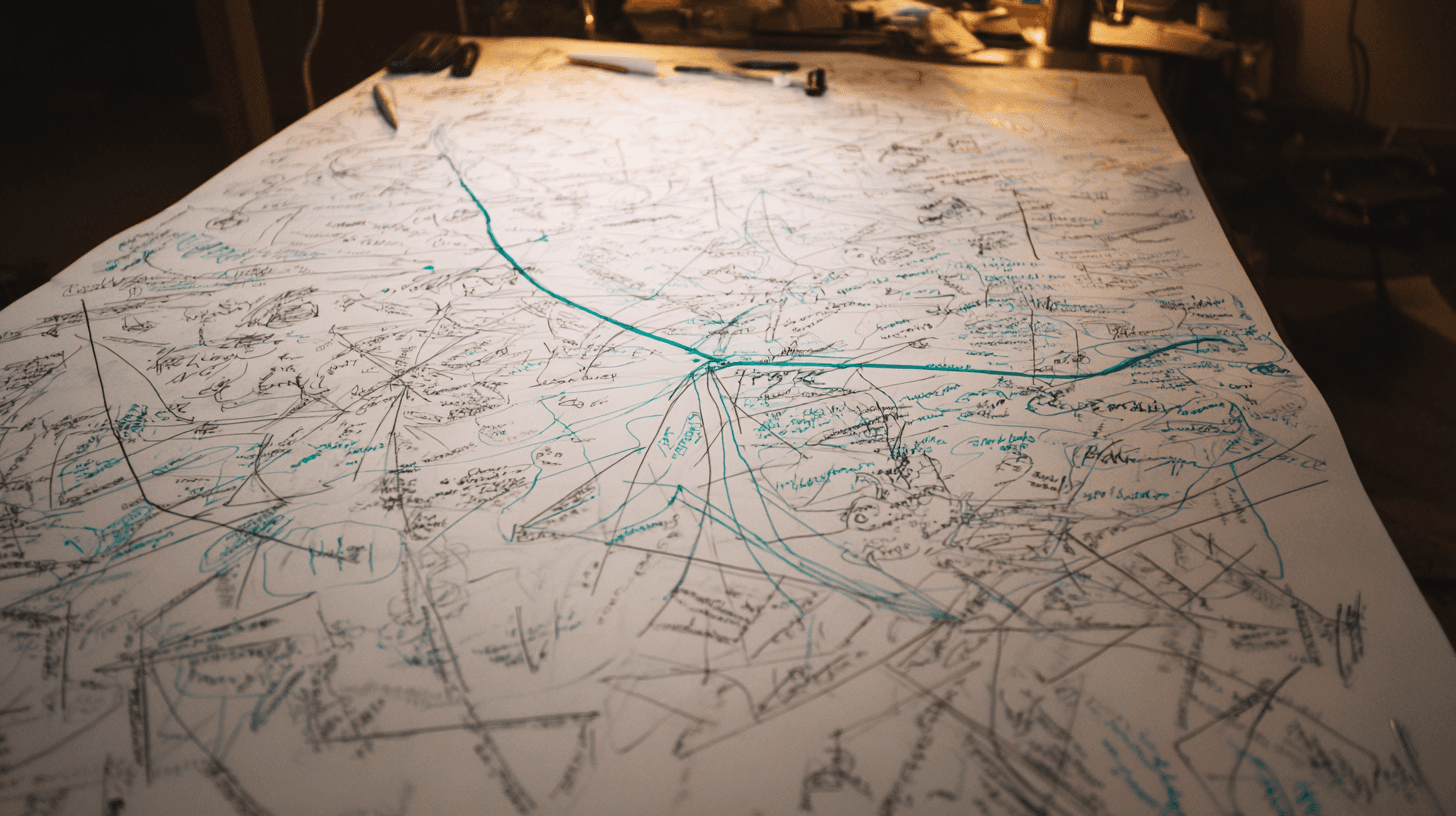
We Start by Mapping the Mess (Not the Screens)
Before a single pixel is designed, we go into systems thinking mode.
We don’t ask:
“What should this page look like?”
We ask:
What decisions does the user need to make?
What information do they need right now vs later?
Where are they confused today?
What causes hesitation, friction, or errors?
We map:
User journeys
Feature dependencies
Permission logic
Edge cases
Business rules
Because most SaaS interfaces aren’t hard to use — they’re hard to understand.
And clarity always comes before aesthetics.
We Design for Mental Models, Not Feature Lists
Complex SaaS products often mirror their backend logic on the frontend.
That’s a mistake.
Users don’t think in:
Database structures
Technical terminology
System hierarchies
They think in:
Goals
Tasks
Outcomes
So we reframe features into:
Actions
States
Progress
Instead of:
“Configure multi-level workflow automation”
We design:
“Set what happens when X occurs.”
Instead of:
“Manage role-based permissions”
We design:
“Who can do what?”
When the interface matches how users think, complexity collapses into familiarity.
We Break Big Flows into Calm, Guided Steps
A common SaaS mistake:
Trying to make users do everything at once.
We turn:
Overloaded screens
Endless forms
Dense dashboards
Into:
Step-by-step flows
Progressive disclosure
Focused moments
Users shouldn’t feel like they’re filling out a government form.
They should feel like:
“I know exactly what to do next.”
Good SaaS UX doesn’t impress.
It reassures.

We Use Design to Reduce Cognitive Load (Not Just Look Pretty)
Visual design isn’t decoration — it’s instruction.
We use:
Spacing to show hierarchy
Color to indicate priority
Typography to guide scanning
Icons to reinforce meaning
Motion to explain cause and effect
Our goal is always:
less thinking, more doing
If users need to “figure it out,” we haven’t designed it yet.
We Remove Friction Where It Hurts Most
Not all friction is equal.
We focus on:
First-time setup
Key workflows
High-frequency actions
Error-prone steps
Because this is where:
Users churn
Support tickets grow
Sales demos break
Product trust erodes
We obsess over:
Fewer clicks
Smarter defaults
Clear error states
Human microcopy
The best SaaS interfaces feel like they’re helping you — not testing you.
We Treat Microcopy as UX, Not Marketing
Buttons, labels, empty states, tooltips — this is where SaaS lives or dies.
We avoid:
Technical jargon
Internal language
Vague labels
We write:
Action-based copy
Plain-language explanations
Context-aware guidance
“Submit” becomes “Create project”
“Error 403” becomes “You don’t have access to this yet”
Good microcopy is invisible.
Bad microcopy is expensive.
We Design for Growth, Not Just Launch
SaaS products evolve. Interfaces must too.
So we design:
Scalable layout systems
Flexible components
Future-proof patterns
We assume:
More features will come
More users will join
More complexity will appear
Our job isn’t to make it simple forever.
It’s to make it simple to grow.
We Test Understanding, Not Just Usability
We don’t just ask:
“Can users click the button?”
We ask:
Do they understand what will happen next?
Can they predict outcomes?
Can they explain the flow in their own words?
If users can explain it back to us, the interface works.
Because true simplicity is not visual — it’s conceptual.
The Real Outcome: Interfaces That Feel Effortless
When complex SaaS is designed well:
Onboarding shortens
Support tickets drop
Feature adoption increases
Sales cycles improve
Retention strengthens
But more importantly…
Users feel:
In control
Confident
Productive
They stop fighting the tool.
They start using it.
Final Thought: Simplicity Is a Competitive Advantage
Anyone can build features.
Not everyone can make them feel:
Understandable
Calm
Intuitive
Enjoyable
In SaaS, the best interface is the one that disappears.
And that’s what we aim for:
Turning complexity into clarity —
so users can focus on what actually matters.